Screenshots show the built-in sample plan — your numbers will look different, but the layout is the same.
Dashboard
Your plan's command center — donut gauge, KPI cards, four chart types, yearly sidebar, and table view.
Verdict band (top row)

Donut gauge
A circular gauge showing the probability that your plan succeeds. Five colored arcs represent outcome categories:
The center shows the success rate. Before Monte Carlo runs, the donut shows a simple binary instead: green "Base case funded" or red "Depleted."
KPI metric cards
Six cards in a responsive grid, visible in the screenshot above. Each has a label, colored icon, large value, and sub-label:
- Lifetime federal tax (violet): Sum of all federal taxes. Sub shows annual average.
- Must-spend coverage (teal): Percentage of essential expenses covered by guaranteed income.
- Roth conversions (blue): Total conversion amount, or "None."
- IRMAA exposure (orange/green): Years with Medicare surcharge, or "None."
- Savings contributed (green): Employee contributions + employer match.
- Legacy (indigo): Final ending balance, or "Depleted before end."
Main chart area
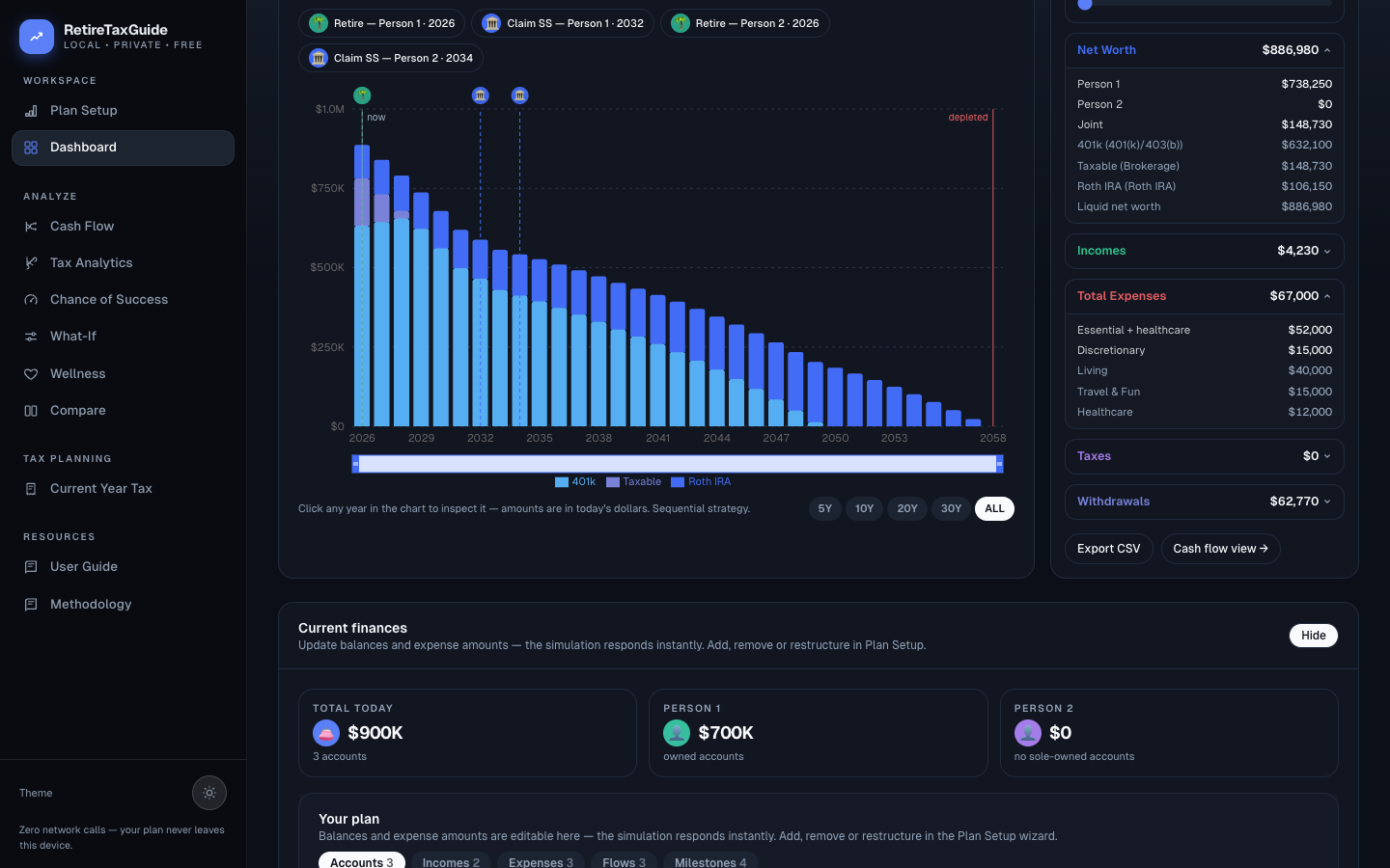
Chart controls
Plot selector: Stacked by account type (default, shown), Net worth, Income vs spending, or Withdrawals by type.
Real/Nominal toggle: Today's $ (inflation-adjusted) or Nominal $ (future dollars).
Chart/Table toggle: Switch between the chart and the data table.
Milestone chip rail
Small pill chips with colored icons — Retire, Claim SS, Home, College, and custom milestones. Each chip matches a vertical dashed line on the chart. A gray "now" line marks the current year, and a red "depleted" line appears in any year the portfolio hits zero.
The other chart types
Net worth: area chart of total portfolio value — a smooth growth curve is ideal; a peak-then-decline means depletion.
Income vs spending: stacked income bars with a red spending line and gray tax line. When bars exceed the red line, the plan is cash-flow positive.
Withdrawals by type: stacked bars by tax type (taxable, tax-deferred, tax-free, HSA, cash) with a red federal-tax line.
Range chips
5Y, 10Y, 20Y, 30Y, ALL — filter the chart's visible year window.
Yearly summary sidebar (right panel)
YearScrubber: Person-age chips, selected year, and a horizontal range slider. Dragging updates all sections below.
Collapsible sections: Net Worth (blue), Incomes (green), Total Expenses (red), Taxes (violet), Withdrawals (indigo). Click to expand/collapse.
Projection table (alternative view)

Columns: Year, Age, Wages, Income, Spending, RMD, Withdraw, Roth conv (blue if > 0), Fed tax, Deferred bal (optional), Balance (red if at or below 0).
Include account-type columns checkbox: Adds/removes the Deferred balance column.
Current finances (quick-edit)
Below the chart: three cards showing today's starting balances (household total plus per-person totals), followed by editable account and expense items. Edits here recalculate the whole projection instantly — use the wizard when you want to restructure rather than tweak.
Income rows are read-only. Social Security rows show the plan's exact claim age in years and months — for example from age 62 y 6 m — which you set in the wizard's SS Explorer; pension, annuity, and other income rows show a whole-year start age.
Advanced analysis

Survivor what-if
For married filing jointly households. A checkbox enables the comparison. Controls: person selector, death age slider. Results show lifetime tax delta, final balance delta, and a "widow trap" explanation.