Screenshots show the built-in sample plan — your numbers will look different, but the layout is the same.
What-If Scenarios
Test changes to your plan without risking the original. Every dial, the comparison chart, and how to save scenarios.
Left rail — Dials
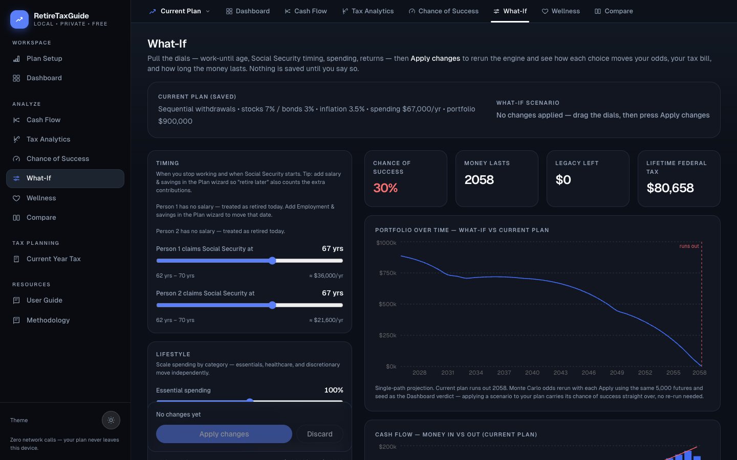
Timing section
- Works until knob: Range from current age to 75. Each dial shows the plan baseline underneath and the current value at right.
- Claims Social Security at knob: Range 62-70, with the estimated benefit recalculated live.
Lifestyle section
- Essential spending % (50-150): Base always 100
- Healthcare spending % (50-150)
- Discretionary spending % (50-150)
- Savings contribution rate % (50-200)
Market assumptions section
- Stock return % (-5 to 15)
- Bond return % (-2 to 10)
- Inflation / CPI % (0 to 10)
- Healthcare inflation % (0 to 15)
Withdrawals section
- Strategy select: Sequential / Bracket Fill / Proportional / Guardrails / VPW
- Bracket target slider: 7-stop slider over actual federal brackets
- Conversion years: Start and end year inputs
Sticky apply bar
Dial moves are drafts until you press Apply changes — the results column keeps showing the last applied scenario meanwhile. The bar shows the pending change count with Apply changes (disabled when nothing is pending) and Discard.
Right column — Results
Four KPI cards
- Chance of success: Percent with delta pill
- Money lasts: Run-out year with delta in years
- Legacy left: Ending balance with signed delta
- Lifetime federal tax: With signed delta
Portfolio over time chart
Line chart comparing current plan (muted, dashed) vs. what-if scenario (primary). Reference lines show run-out years.
Cash-flow chart
Stacked bars (guaranteed income + withdrawals) with overlaid expense (red) and tax (gray) lines.
"What you changed" table
Columns: Change / Current plan / What-if. Three stat boxes: last salary year, first SS, portfolio runs dry.